Case study 01 / 03
Lucid
Lucid Acupuncture & Holistic Wellness · Encinitas, California
A calm, image-led site for a boutique acupuncture practice, shaped around one decision: booking a first visit.
- Industry
- Acupuncture & Holistic Wellness
- Year
- 2026
- Services
- Website Strategy, UX/UI Design, Responsive Development, Conversion Architecture
Overview
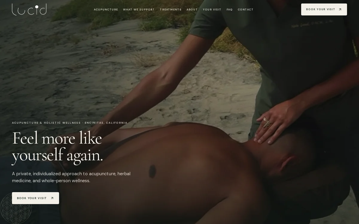
Lucid is a boutique integrative wellness practice in Encinitas, California. The site leads with warm botanical photography and a quiet serif voice, lets visitors start from what they are experiencing, and keeps Book Your Visit within reach from the first screen to the last.
What the design focuses on
- 01
Start from the visitor
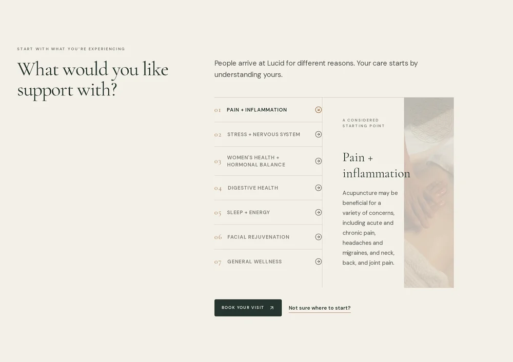
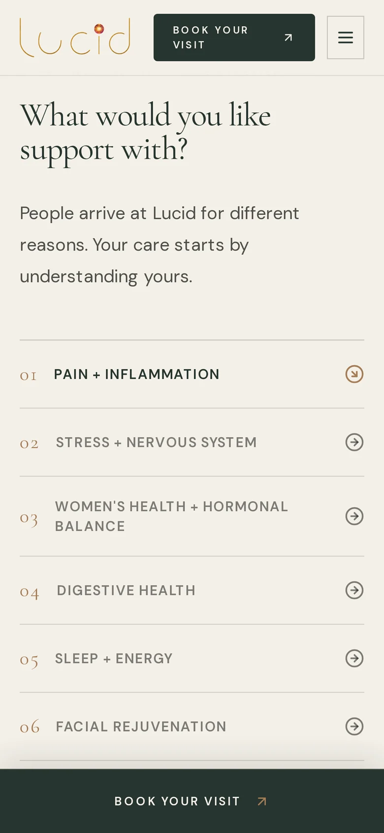
Care is organized by what people are experiencing, from pain and inflammation to sleep and energy, in an interactive selector that explains each area before asking for anything.
- 02
Explain the visit
The approach is told in plain steps (Listen, Treat, Adapt) so a first visit feels understood before it is booked.
- 03
Put a person forward
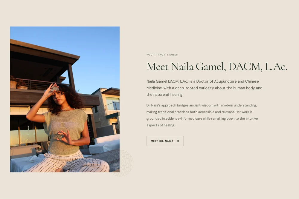
Dr. Naila Gamel, DACM, L.Ac., is introduced with her credentials and approach, followed by patient words and answers for people new to acupuncture.
- 04
Keep the next step close
Book Your Visit sits in the header, after the care selector and in the closing invitation. On phones it stays docked at the bottom of the screen.
Desktop experience
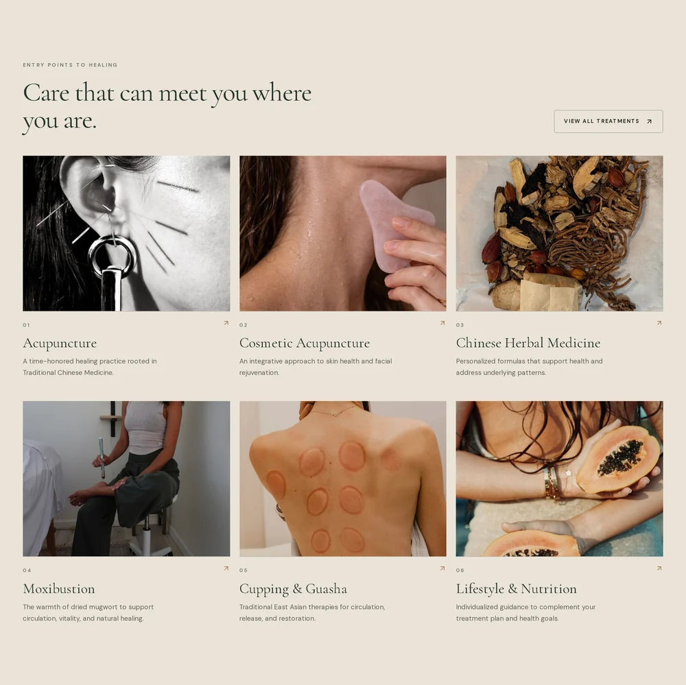
Treatments, each given its own photograph and a one-line explanation.
Mobile experience
Designed for the phone, not shrunk onto it.
On a phone, the booking bar stays docked at the bottom of the screen.

Conversion
Every page leads somewhere.
Every section ends somewhere useful. The care selector closes with Book Your Visit and a gentler Not sure where to start?, and the page finishes on a single invitation with a second route for questions.

The complete site
Top to bottom.
The full Lucid home page, as it stands today.
View live site (opens in a new tab)